As painters, we are in the business of colour! From experience, we know how tricky it can be to select your all-important colour scheme. We have worked on multiple projects where clients have changed their minds about a colour choice early into the project as it “just doesn’t look right”, resulting in us repainting in a new colour, occasionally more than once!

In order to avoid you ever needing to do the same, we’ve compiled a few tips to keep in mind when selecting your colours for your next painting project.

The colour of something is the appearance that it has as a result of the way in which it reflects light”.

LIGHT

Lighting can have a huge impact on colour, and can completely change its look. As we all know, indoor artificial light is very different to natural light, but did you know that natural light can also change a colour depending on the direction the light is coming from?

Spaces that are lit by northern natural light remain the most neutral, whereas rooms lit from the east or the west can significantly change a colour. Eastern light tends to be a yellow light that is stronger of a morning, and western light can be so strong that it may even appear orange. In contrast, spaces lit by southern sun will have a bluer or cooler toned light that is relatively consistent throughout the day.

Given this, it’s always a good idea to sample your desired colours within your own space to see how it would look in reality, considering the way your space is lit.

UNDERTONE

Undertone is not something immediately apparent, nor is it something we’re inclined to consider at first glance, however the undertone of a colour can make or break a colour scheme depending on the lighting and colours used around them.

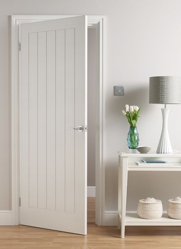
For example, a white paint with a green undertone may appear perfect until painted behind orange or warm coloured timber, at which point the contrasting warmth of the timber can make the cooler green undertone very apparent.

Undertone can be tricky to detect to the naked eye, especially in whites. It’s a good idea to hold a true white (such as Dulux’s Vivid White) up to the white paint you may be considering, which should bring out the undertone. From there, you know what you’re working with to either harmonise your colours with those of similar undertones for a well-coordinated colour scheme, or to intentionally create a contrasting colour scheme!

Alternatively, you may wish to bring the professionals in for a formal colour consultation, to let them guide you and provide their professional recommendation. We contract a team of qualified interior designers and colour consultants who can do just this, and whose services  are provided to you fee-free for any full internal or full external painting project.

Read More

The task of undertaking a renovation is an exciting one! The chance to make a property your own by making the modifications you’ve chosen and adding your own flair is an opportunity not all are fortunate enough to come by, and should certainly be appreciated. Whilst exciting, we know that this can also be a very daunting process that can become quite expensive if you’re not careful.

We have a few tips and tricks up our sleeves to help you with your renovation budgets, so if you’re a property owner who is considering (or maybe even in the middle of) a renovation, read on!

ALUMINIUM WINDOWS AND DOORS

If your windows or doors are still trapped in the 80’s with a stale shade of mission brown, cream or silver, there is an alternative solution to trying to coordinate them into your new colour scheme, or replacing them! Using spray techniques, we can paint aluminium windows and doors in the colour of your choice, bringing them in line with the rest of your property. The finish is long-lasting, and looks as good as new.

The photos below were taken this week (July 2018) during a visit back to a project completed in Carindale in early 2016. The windows and sliding doors had been a very patchy and tarnished looking silver originally, and are now finished with Dulux Monument. The results were fantastic two and a half years ago when we first we completed the project, and still look just as great today. The facelift has proven to be durable and glossy, even in and around the latches and door hardware.

TILES AND CABINETRY

If your cabinetry or tiles are in a good condition (sturdy, chip free, and aren’t warped) but are in need of a facelift, it is also possible to repurpose these using a two-pack paint system.

Two pack paint systems are protective coatings that provide hard and durable finishes, in a semi-gloss or gloss finish. The durability and sheen level makes two pack paint systems ideal for painting tiles and cabinetry, again with a spray finish.

By painting these surfaces instead of replacing them, you would not only be able to save on costs, but would also have control over the colour choice and wouldn’t be restricted by pre-determined colour options available from retailers. When paired with new handles, the painting of cabinetry can completely change the look of a space, especially kitchens!

Read More

Selecting the correct sheen level for interior painting

For those considering painting a room or two themselves, there are a number of things to bear in mind to ensure that you achieve the right finishes, and results that last. Preparation is crucial, and of course there is the all-important colour selection, but what about sheen levels?

If you’ve ever felt overwhelmed or confused (like our pup friend) whilst standing in front of shelves upon shelves of paint drums at your local paint store or Bunnings, read on for a few tips to get you started.

CEILINGS

For the majority of ceilings, you’ll want to use a flat paint. Flat paint covers blemishes in plasterboard well, including covering joins between plasterboard sheets. It is easy to apply and is a lot less likely to show any stop and start marks left when rolling, some of which would be expected from a DIY painter. Whilst flat paint isn’t as washable as paints with higher sheen levels, this isn’t of great concern as our ceilings are lot less likely to need washing.

The exception to using flat paint is in bathrooms and separate kitchens. For these areas, where condensation and moisture are more likely (from showers, range-hoods etc), it is best to use a specific kitchen and bathroom ceiling paint. Kitchen and bathroom ceiling paints have a slightly higher sheen level, making them more washable and less likely to grow mould. This said, for kitchens that are part of an open plan area where the ceiling is continuous into other spaces, regular flat ceiling paint should suffice, as the openness of the space itself provides ventilation and air flow.

WALLS

Low sheen is generally your go to paint for walls, whether they’re plasterboard or VJ boards. The added touch of sheen compared to flat paints does mean that stop and start marks or imperfections are a little more noticeable, so you do need to be consistent with your application. On a positive note, the added sheen increases the durability and washability of your walls, which is especially important for homes with children. Low sheen paint is still relatively easy to apply for a DIYer also.

DOORS, WINDOWS, ARCHITRAVES AND SKIRTINGS

For all “trims”, it’s a gloss or semi-gloss waterborne enamel paint that you’re after. Both gloss and semi-gloss paints are hard wearing and highly washable, which is ideal considering the surfaces painted in these are the most likely to be knocked and touched by grubby fingers. As for which sheen level you select, it’s really down to personal preference. Gloss provides a high sheen level, and is generally the more traditional detail paint as seen on fan lights in Queenslanders, or on picture/chair rails. Semi-gloss is slightly less luminous, and has a more modern and minimalist feel.

Read More